Editorial Design
Editorial Design
EL ORIGEN DEL ABECEDARIO
EL ORIGEN DEL ABECEDARIO
Role: Editorial Designer & Production
Context: Collaborative university project,
team of 14 designers
Recognition: Gold, IDA Design Awards — Print / Zines and Flyers | Print 2025, Design Week México
Role: Editorial Designer & Production
Context: Collaborative university project,
team of 14 designers
Recognition: Gold, IDA Design Awards — Print / Zines and Flyers | Print 2025, Design Week México
Role: Editorial Designer & Production
Context: Collaborative university project,
team of 14 designers
Recognition: Gold, IDA Design Awards — Print / Zines and Flyers | Print 2025, Design Week México
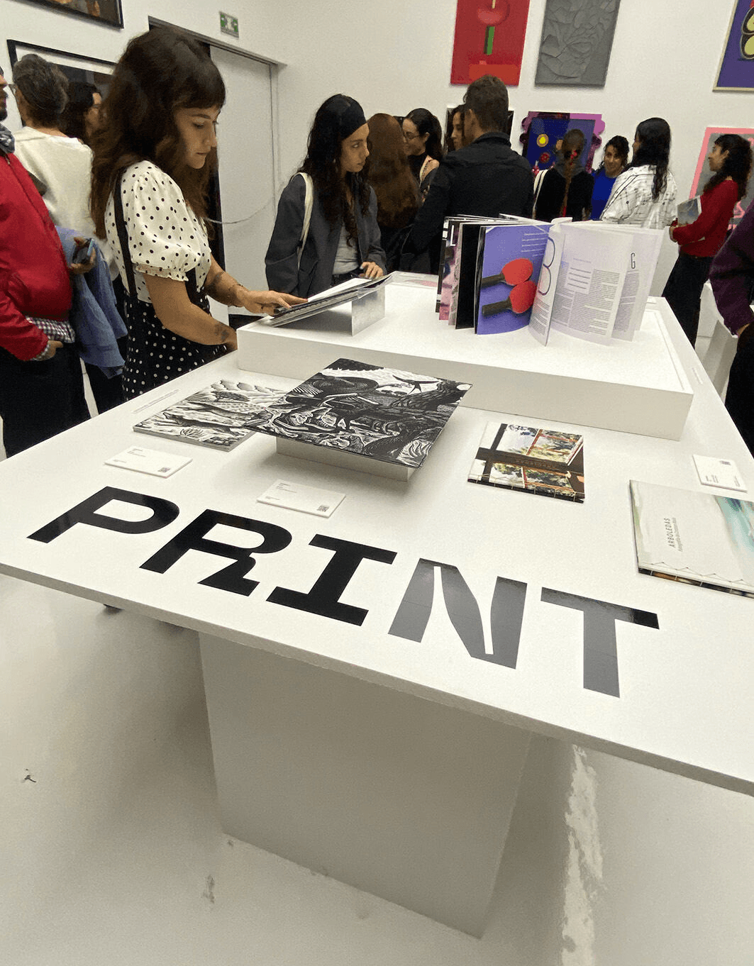
14 designers. 14 letters. One magazine. El Origen del Abecedario was a collective editorial exploration of typography as visual language. It won Gold at the IDA Design Awards and was selected for exhibition at Design Week México.
My letter was B. Rather than illustrating it literally, I turned it into a visual puzzle: two ping pong paddles photographed at just the right angle to hide a B in plain sight. Abstract at first glance, impossible to unsee once you spot it. I designed the layout and color to guide the eye toward the hidden form, letting the image lead while the typography
held everything together.
14 designers. 14 letters. One magazine. El Origen del Abecedario was a collective editorial exploration of typography as visual language. It won Gold at the IDA Design Awards and was selected for exhibition at Design Week México.
My letter was B. Rather than illustrating it literally, I turned it into a visual puzzle: two ping pong paddles photographed at just the right angle to hide a B in plain sight. Abstract at first glance, impossible to unsee once you spot it. I designed the layout and color to guide the eye toward the hidden form, letting the image lead while the typography
held everything together.

Beyond my spread, I was part of the physical production: printing and an unconventional binding process that became part of the magazine's identity. This project proved something I deeply believe: individual creative freedom and collective coherence aren't opposites. You just have to design for both.
Beyond my spread, I was part of the physical production: printing and an unconventional binding process that became part of the magazine’s identity. This project proved something I deeply believe: individual creative freedom and collective coherence aren’t opposites. You just have to design for both.
Editorial design and photography by Rebeca Martinez, as part of a 14-person collaborative team
Editorial design and photography by Rebeca Martinez, as part of a 14-person collaborative team


© Rebeca Martinez
2026